SkeleBricks is a bare-bones wireframe library built specifically for Bricks Builder. It provides a structured, scalable foundation using native features like Theme Styles, CSS variables, and clean BEM class architecture.
Key Features
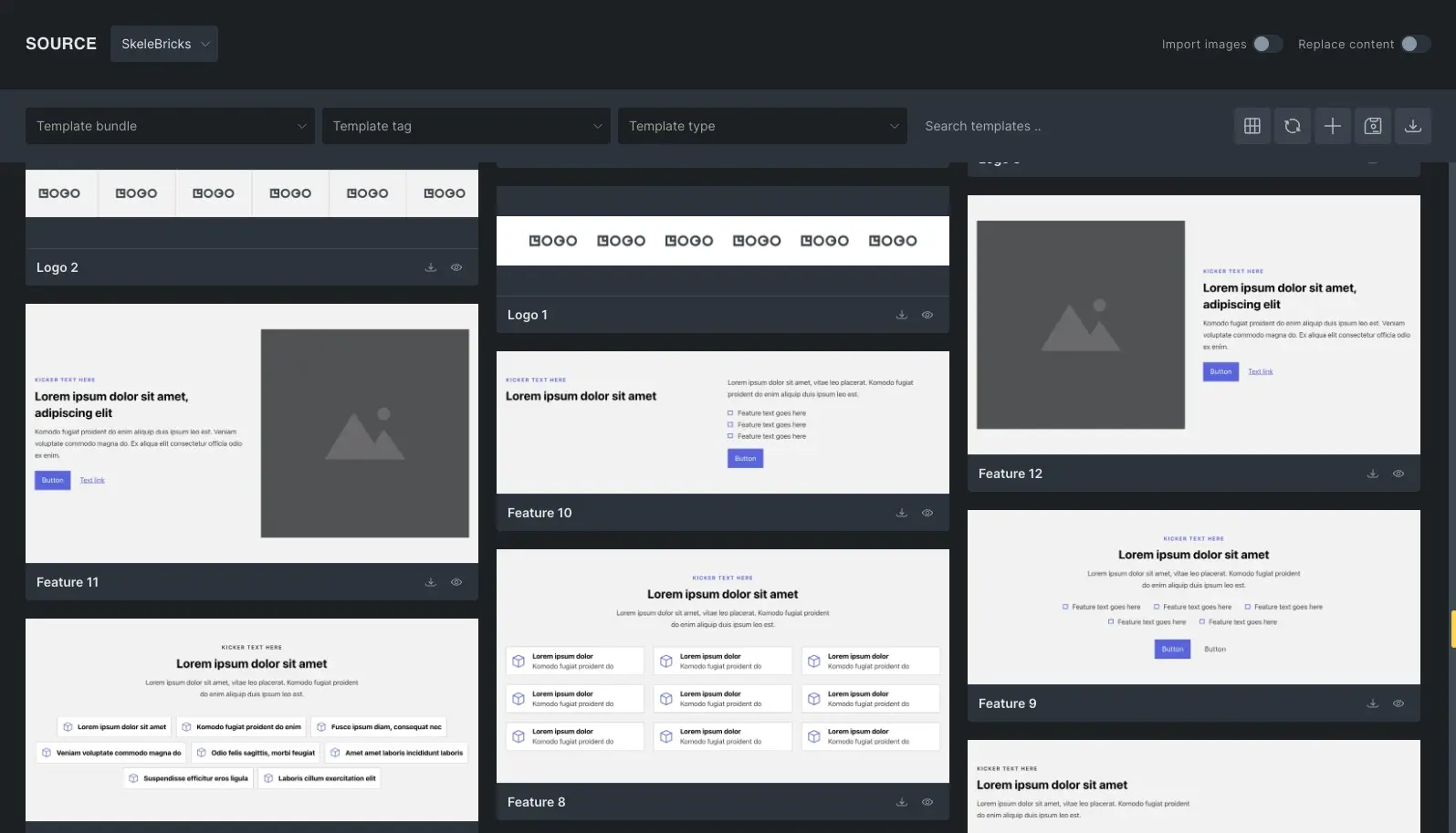
- 100+ pre-built, design-ready layouts.
- Focus on accessibility, BEM classes, and clean HTML structure.
- Takes full advantage of native Bricks capabilities.
- Opinionated yet sensible global defaults across CSS variables and theme styles.
- Dark and Light theme-ready out of the box.
- Easily customizable and responsive by design.
- A growing library with new layouts added regularly.
SkeleBricks uses the native Bricks framework (Style Manager) to use only the most essential defaults and variables for rapid web design.
Every layout is built from real-world usage – focused on performance, consistency, and flexibility – so you can move faster without compromising quality.
Getting Started
We recommend starting with a fresh Bricks installation to avoid breaking your current design.
Getting started with SkeleBricks is a simple 3 step process.
1. Create Your Account
Sign up for a Free account to access the library.
2. Import the Foundation
Download and import the required JSON files:
- Theme Styles
- Variables
- Color Palette
These are essential. All layouts depend on this global system – without it, styling will break.
The zip file containing theme style, variables and color palette can be downloaded by logging into your customer dashboard.
3. Access the Library
You can access SkeleBricks library in two ways:
Remote Library (inside builder)
Remote Library access details can be found in your customer dashboard.
Copy/Paste (Quick Copy or BEM Rename)
To access the library with Quick Copy & BEM Rename features unlocked:
- Log into your Customer Dashboard.
- Click the Explore Library link or return to the Home page and click Browse Library. This will automatically sync your account and unlock your access.
Recommended Bricks settings to make sure layouts work as expected:
- Enable Class, Variable and Color preview on hover under Settings > Control panel
- Enable SVG uploads for Administrator in Bricks > Settings > General to make sure that sections with SVGs work correctly.
- Enable Code Execution under Bricks > Custom Code to make sure that sections with custom code work correctly.
Anatomy of SkeleBricks
SkeleBricks is built to work with Bricks, not against it. By combining native Theme Styles with a centralized CSS variable system and a semantic BEM structure, we’ve created a lean architecture that gives you global control over colors, typography, and spacing without the bloat or limitations of traditional frameworks and layout libraries.
⚙️ CSS Variables
SkeleBricks layouts are powered by a lightweight CSS variables framework. Variables ensure that they work out of the box while still allowing users to override these pre-made variables with their own values via Style Manager.
You can find them inside Bricks builder > Style Manager > Variables tab. Change their values to match your project needs.
🎭 Theme Styles
SkeleBricks leans heavily on Bricks Theme Styles to handle global styling wherever possible. Instead of relying on layers of utility classes, it combines Theme Styles with a minimal set of CSS variables for colors, typography, and spacing – keeping everything consistent and easy to control.
This approach unlocks a level of flexibility that most frameworks and layout libraries overlook. You can adjust section spacing, container widths, typography defaults, and native element styles like buttons and forms – all globally and instantly, without touching a single class.
🧩 BEM Methodology
SkeleBricks uses a clean, consistent BEM (Block, Element, Modifier) methodology to structure every layout. Each section is built with sensible, readable class names, making styles predictable, scalable, and easy to maintain as your project grows.
Every section or component is treated as a Block – a standalone, meaningful entity. The internal parts of that block (like a heading or an image) are Elements, and any variations in style, color, or state are handled by Modifiers.
Examples
A Hero Section

.hero(The Block).hero__container(An Element).hero__heading(An Element).hero__description(An Element).hero--dark(A Modifier for a dark-themed variant)
A Card Component
- .
card(The Block) - .
card__img(An Element) - .
card__heading(An Element) .card__text(An Element)- .
card--featured(A Modifier for a unique style)
This structure makes your layouts highly portable; you can move a block from one page to another without worrying about CSS collisions or broken designs. It also helps your projects remain organized, scalable, and easy to maintain.
While many frameworks insist on using mandatory prefixes that create visual noise in the structure panel, SkeleBricks prioritizes a clean, semantic approach. We believe that class names should be intuitive and fast to work with. By removing unnecessary prefixes and sticking to a consistent BEM logic, SkeleBricks keeps your workflow lean and your code readable, mirroring the way Bricks is meant to be used.
SkeleBricks offers a BEM class rename feature for both free and pro layouts, allowing you to customize class names to match your project’s structure before importing into Bricks.
